Adaptive User Interfaces with UIStackView and UICollectionView
Starting with iOS 8, Apple began encouraging developers to build "adaptive user interfaces" - interfaces that can happily scale from the iPhone 4s all the way up to much larger devices like the recently released iPad Pro. Technologies like Auto Layout made creating scalable interfaces much simpler, and iOS 8's UITraitCollection finally decoupled the device type (iPhone or iPad) from deciding how to layout an interface. With iOS 9, Apple introduced a new view class called UIStackView, which radically simplifies common layouts that would usually be accomplished with boiler-plate Auto Layout Constraints. This new view makes creating and maintaining interfaces much simpler as the nuts and bolts of Auto Layout are hidden away and the UI is described in a much higher-level, declarative manner. UIStackView also allows us to easily change our layout in order to be adaptive to size changes, as I will demonstrate with a small sample project that you can download here.
Demonstration
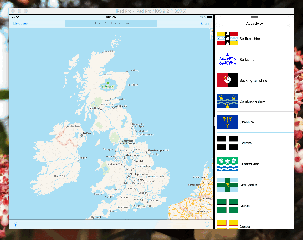
Our demo focusses on a small application which uses a collection view to display a list of English counties. When running on an iPhone, or rather when running using an interface with a compact width, we see our list in a table style view:
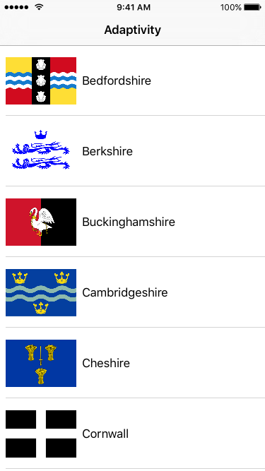
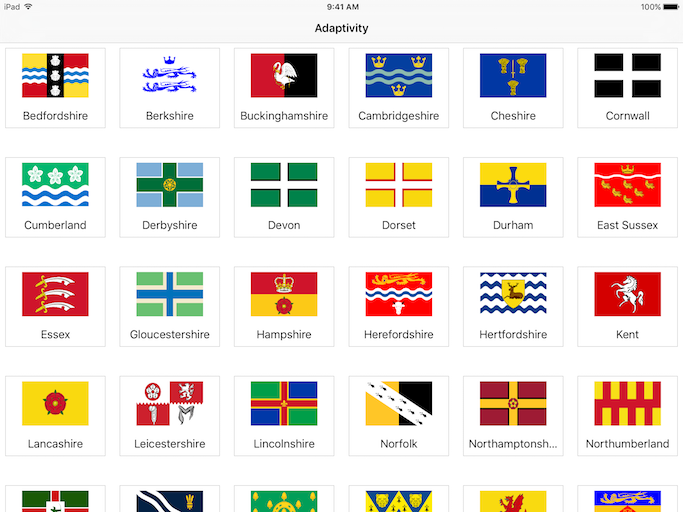
Fairly standard stuff. At first glance this looks very much like a table view, but is really a collection view. This is because when running in a regular width environment, like an iPad, we want our list of counties to take advantage of the extra space by presenting the list in a grid form, like so:
We achieve this change of layout very simply by using UICollectionViewFlowLayout and setting its layout properties appropriately for our view controller's trait collection. We set the item size and spacing depending on whether we are operating within a compact or regular width environment.
There is however one other significant change which has occurred between these two layouts. In compact width, the cell's content is aligned horizontally, but in a regular width environment the content is aligned vertically. To achieve this using Auto Layout Constraints would mean setting up and managing two different sets of constraints within the collection view cell. This adds an extra maintenance overhead, and switching between the two sets of constraints can be error prone, leading to all kinds of horrifying warnings in Xcode's terminal. To escape this, two different cells can be registered with the collection view, one aligned horizontally and one vertically. But this means duplicating setup, doubles the number or IBOutlets to configure, and means that cells cannot be reused when switching between compact and regular width environments (more on this later).
By using a stack view in our cells, we avoid both of these scenarios. We can use a single stack view to achieve both of these layouts incredibly simply by using the following code in our collection view cell:
var displayStyle: CountyCellDisplayStyle = .Table {
    didSet {
        switch (displayStyle) {
        case .Table:
            stackView.axis = .Horizontal
        case .Grid:
            stackView.axis = .Vertical
        }
    }
}
By switching our stack view's axis, all of the layout changes are taken care of for us. We don't need to fiddle with layout constraints as the stack view handles that itself. We simply tell the stack view which axis to layout its contents on, and it handles the rest.
Results
The real magic of adaptive user interfaces comes when devices change their trait collections at runtime. For example, here is our demo app running on the iPhone 6s Plus:
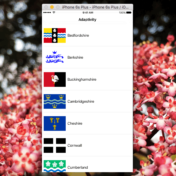
The Plus sized iPhones have a "regular" width when in landscape, unlike smaller iPhones which remain compact. We have taken advantage of the extra screen space by using the grid layout without writing a single line of code to handle the larger sized iPhones - we get this behaviour for free simply by using the adaptive UI APIs correctly.
Also, take resizing on an iPad Pro in split view:
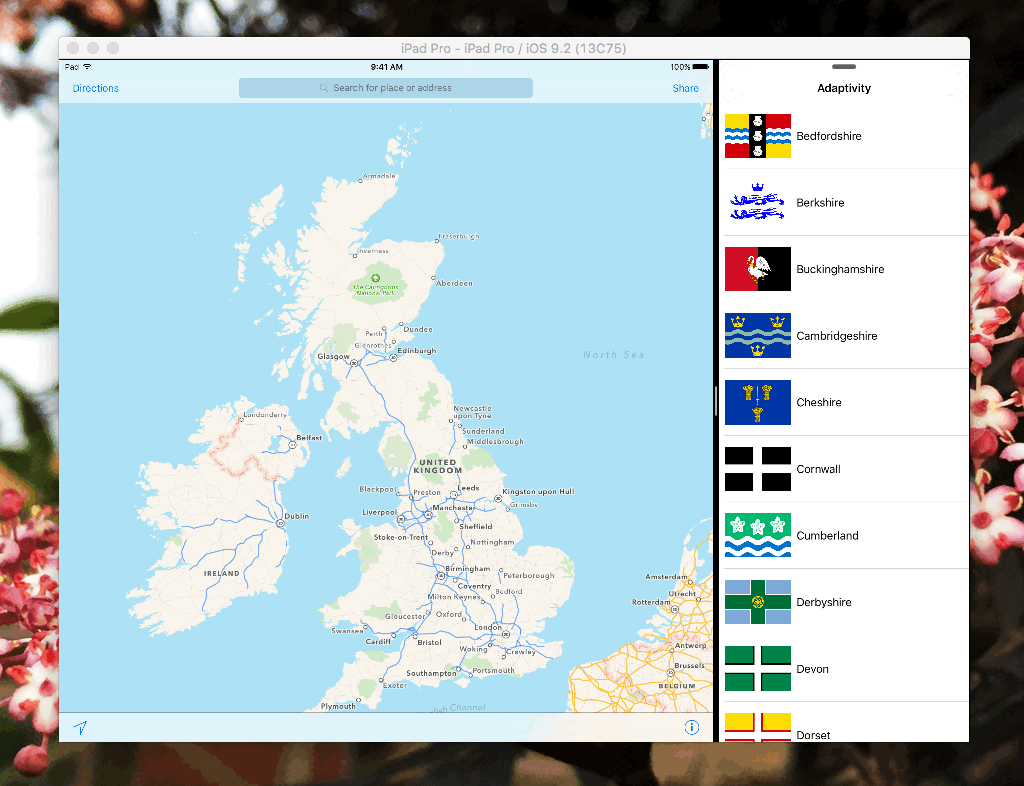
Again, we benefit from the extra screen space without writing any special code to handle the device. This means our app will take advantage of devices that Apple create in the future without us having to do any extra work.
Presenting County Details
When tapping on a county, we are presented with its details. Notice how the presentation changes when the app changes size:
This is an example of an adaptive presentation, where the presentation UI changes depending on the amount of screen space available to the app. You can create your own adaptive presentations using UIPresentationController, which adapts to size changes using the same size class API that we used when adjusting our collection view cells.
Our county details view also uses a stack view to show the county details, meaning we can display the flag, name, and population all without setting up any constraints between the individual elements. No more boiler-plate constraint wrangling in Interface Builder!
Conclusion
When building UIs, we should always consider how our apps will work on screens with different sizes. By utilising the trait collection APIs as well as technologies such as Auto Layout and UIStackView, we can build user interfaces that will give a great user experience on Apple's present and future devices, all whilst keeping the amount of code that we have to write to a minimum. Next time you're building an interface, consider how these tools can help you to create a UI that will look great for all of your users, no matter what device they are using.