Creating Custom SF Symbols Using Affinity Designer
From a design perspective, one of the most exciting changes introduced in iOS 13 was the inclusion of SF Symbols.
SF Symbols provides a set of over 1,500 consistent, highly configurable symbols you can use in your app. Apple designed SF Symbols to integrate seamlessly with the San Francisco system font, so the symbols automatically ensure optical vertical alignment with text for all weights and sizes. SF Symbols are available in a wide range of weights and scales to help you create adaptable designs.
Having access to such a wide range of well designed glyphs not only reduces the number of custom graphics that need to be designed for an application, it also provides guidance and inspiration for how to design application iconography for scenarios where the built-in glyphs are not suitable.
It is this situation, when none of the Apple provided symbols suit our needs, that we will focus on today. In this case, we need to design our own custom SF Symbol. Fortunately, creating a custom symbol is a simple process, the mechanics of which are detailed below using Apple's SF Symbols application, Affinity Designer by Serif, and Xcode. We will walk through the process of creating a simple pentagon shape symbol, designing it for all of the adaptations and sizes that the SF Symbols system supports, and then show how to export our symbol and make use of it in an application.
Design of a Custom SF Symbol
Step 1 - Find a system symbol with similar proportions
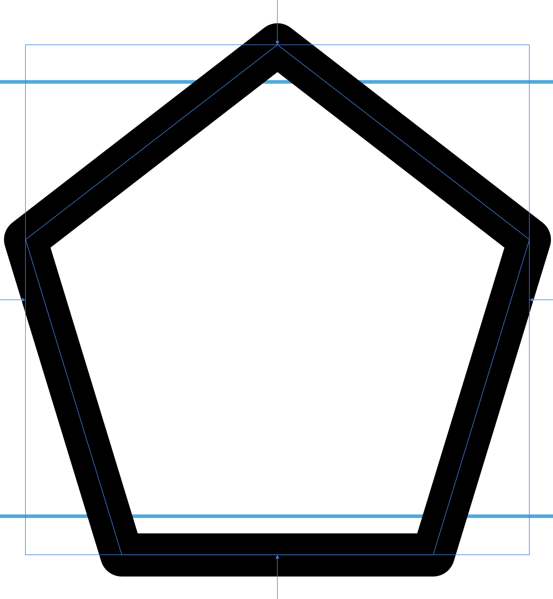
Each SF Symbol contains leading and trailing margins, as well as Capline and Baseline offsets. In order to have these configured correctly for our symbol, we need to find a system symbol with similar proportions to the one we're designing.
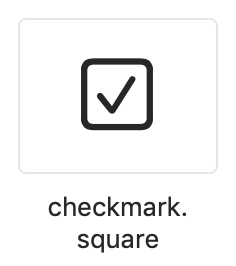
To do this, we need to open the SF Symbols app and look for a symbol with such proportions. For our pentagon symbol, we can use the checkmark.square symbol:
Step 2 - Export the symbol
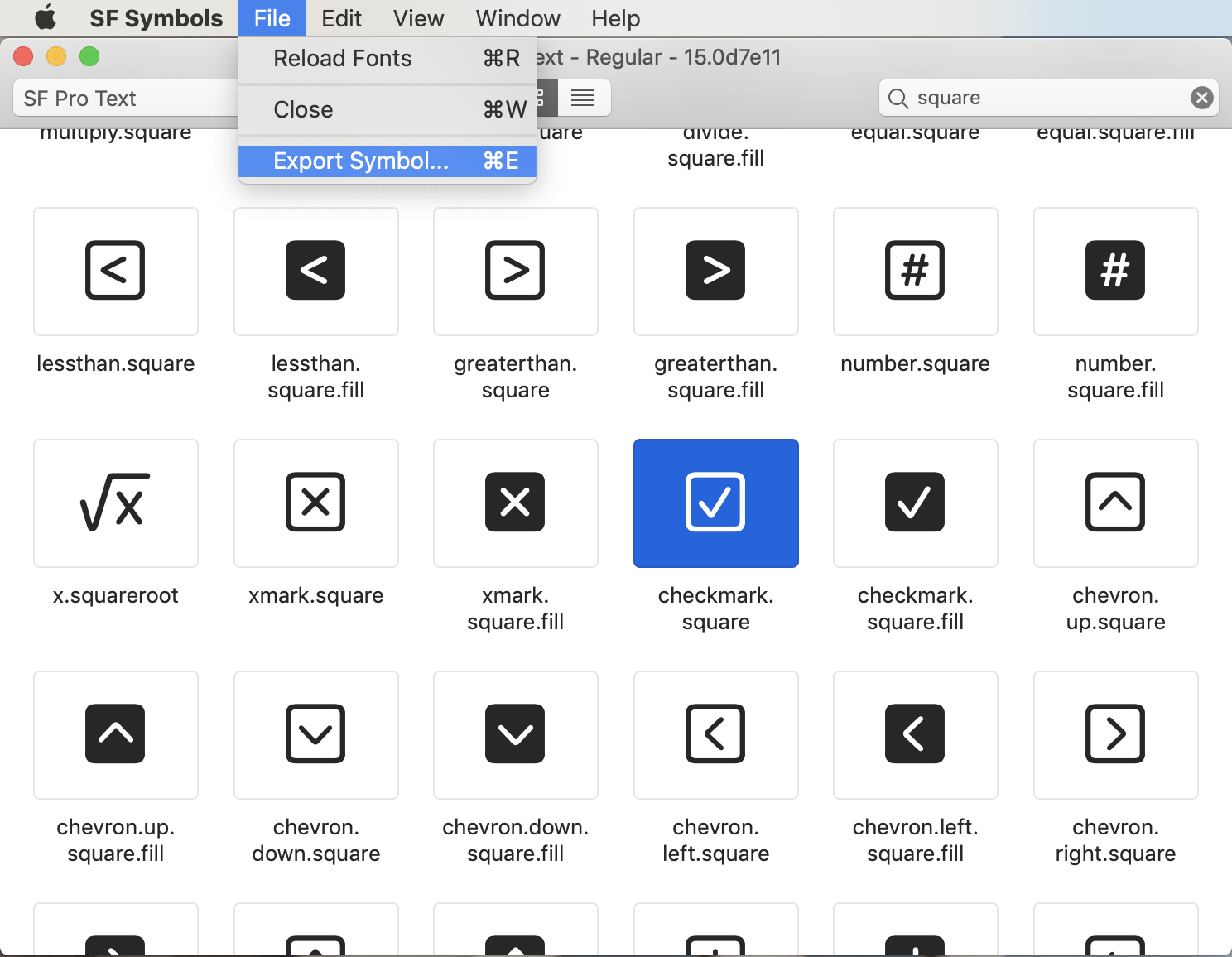
After selecting the checkmark square symbol, select "File > Export Symbol...".
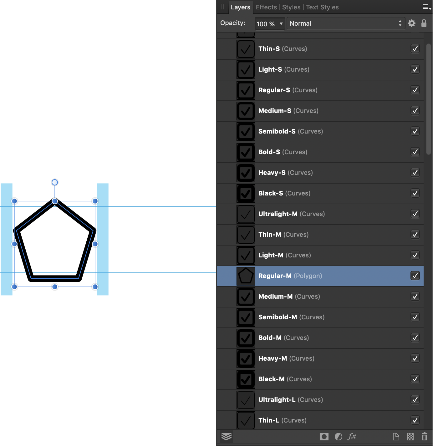
Step 3 - Select the 'Regular-M' layer
Open the SVG symbol file that you just exported in Affinity Designer. Once you have done this, select the Regular-M layer:
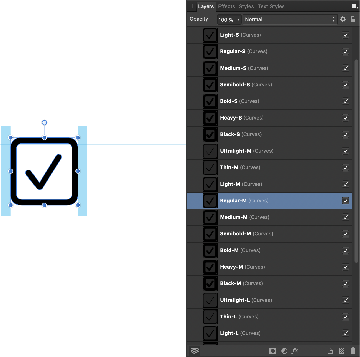
The Regular-M layer is the only layer to have the leading and trailing margin guides present, so it is the best layer to modify first.
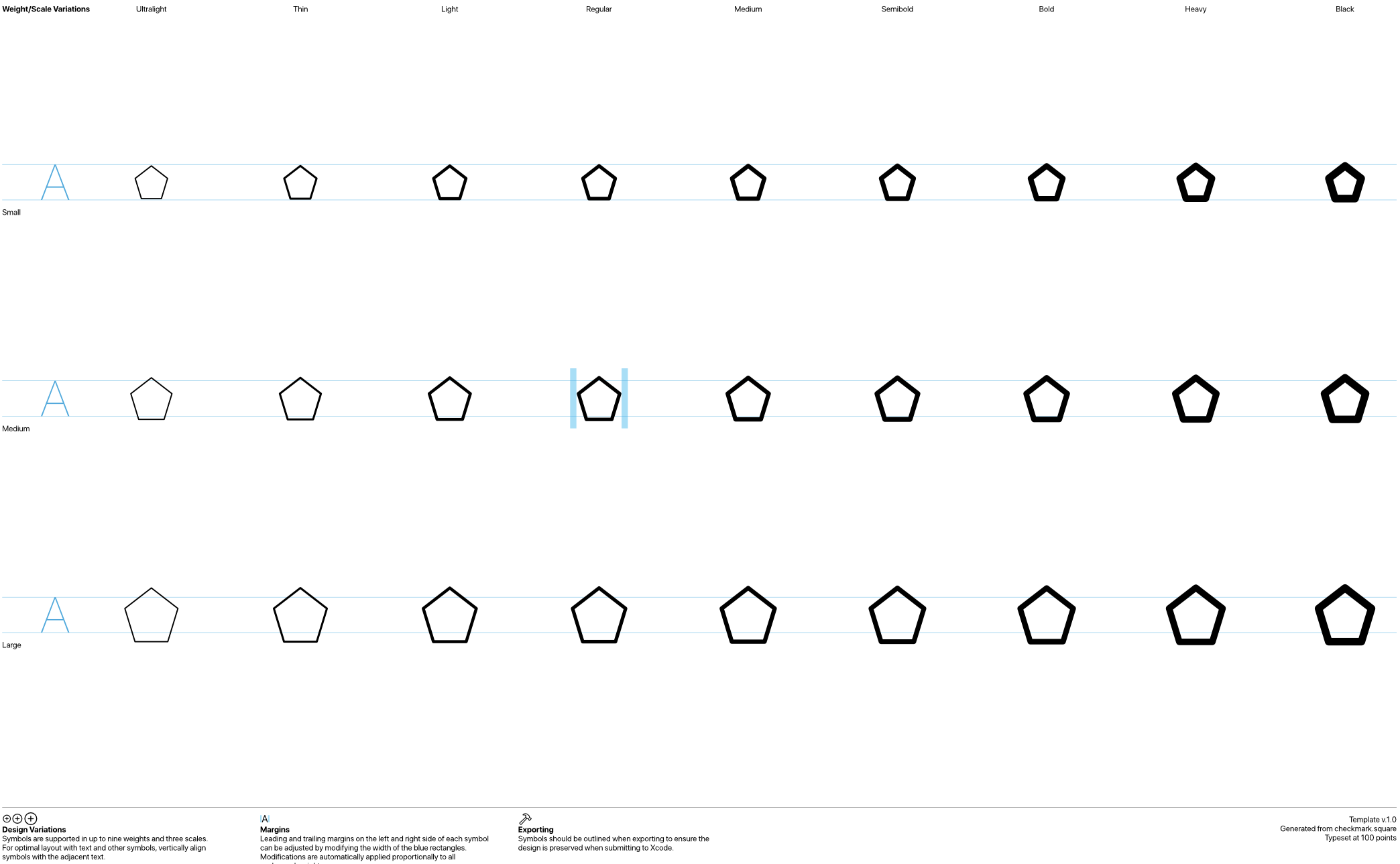
You will notice that there is a naming convention for the symbol layers. The word before the dash corresponds to the font weight that the symbol is appropriate to be shown alongside. The capital letter after the dash represents either 'small', 'medium', or 'large', which are the three sizes that symbols can be displayed at.
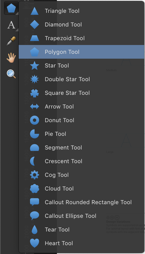
Step 4 - Select the pentagon shape tool
We are going to be creating a pentagon shape symbol, so make sure you are in the Designer Persona and select the pentagon tool from the shape tool on the left hand side of the window:
Step 5 - Configure the stroke
The Regular-M shape of the symbol that we have exported uses lines that are 7 points wide. In order to keep our symbol visually balanced with the existing system symbols, we will use the same width for the stroke of our pentagon:
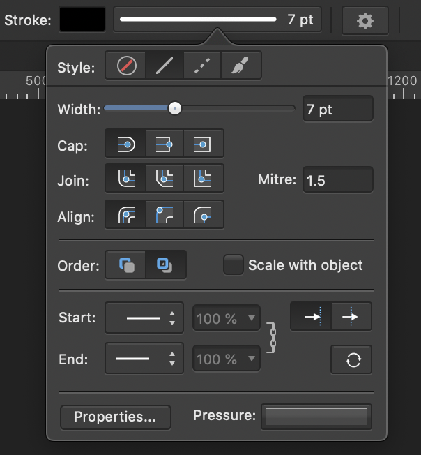
We will also use a round cap and round join to match the style of the system symbols.
Step 6 - Replace the Regular-M layer
Once we have drawn a pentagon shape that is aligned with the existing Regular-M layer, we should delete the original layer and use its name for our shape's layer:
When importing an SF Symbol in to an Xcode project, the names of the layers are what is used to determine which shape is used depending on the configuration that is given (font weight and symbol size). It is therefore vital that the shapes that we create in our document use the correct layer names.
Step 7 - Duplicate and move layer
Next, duplicate the Regular-M layer and move it across to align it with the Light-M layer, using the shift key to keep the new layer vertically aligned with the old one:
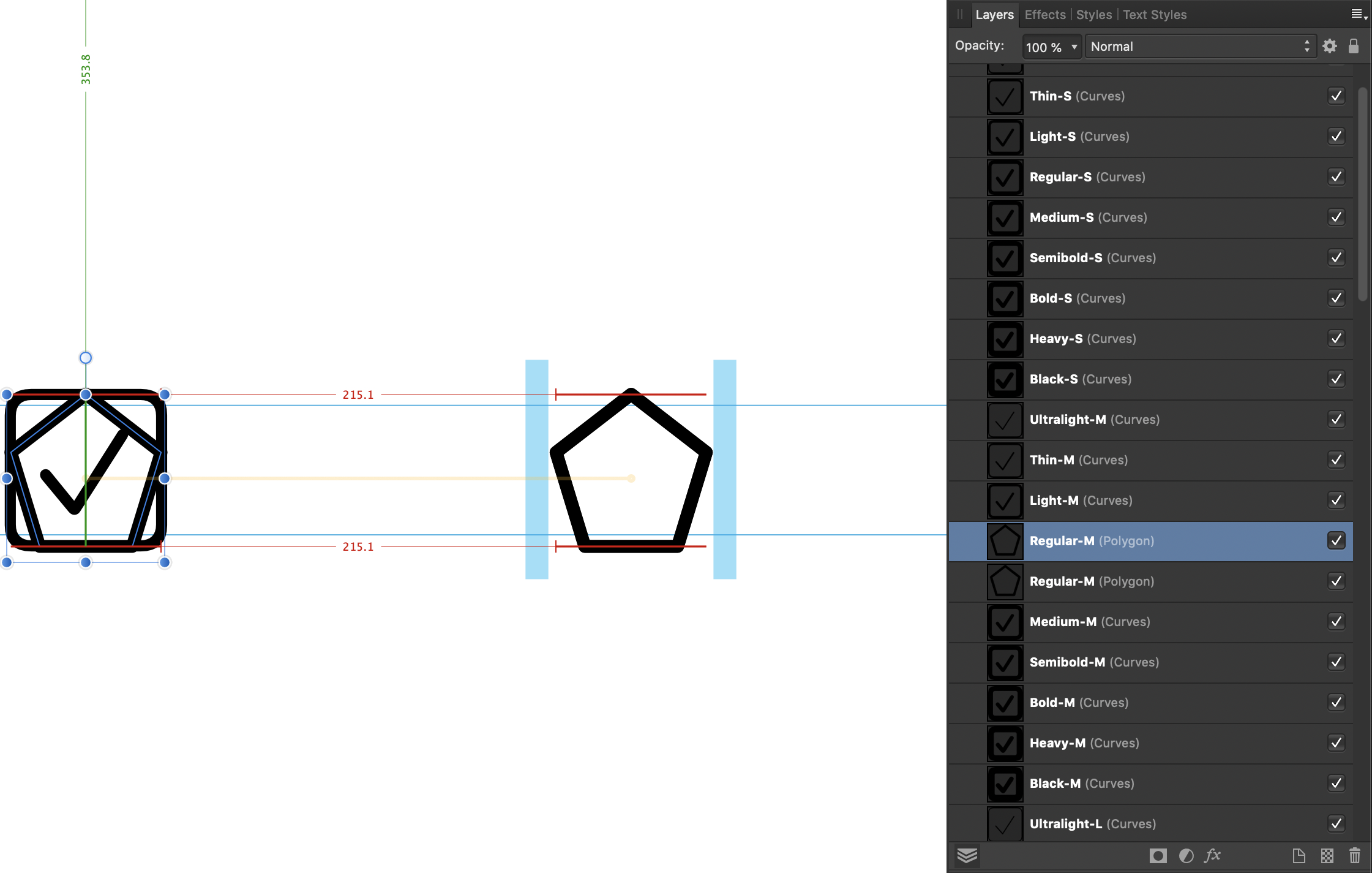
Once you have the shape aligned correctly with the existing Light-M layer, you will need to adjust the stroke width of the shape to match the stroke width used by the Light-M checkmark symbol. In this case, the stroke width we need to use is 6 points.
When the pentagon shape has been positioned and had its stroke set appropriately, delete the existing Light-M layer and rename the shape layer to 'Light-M'.
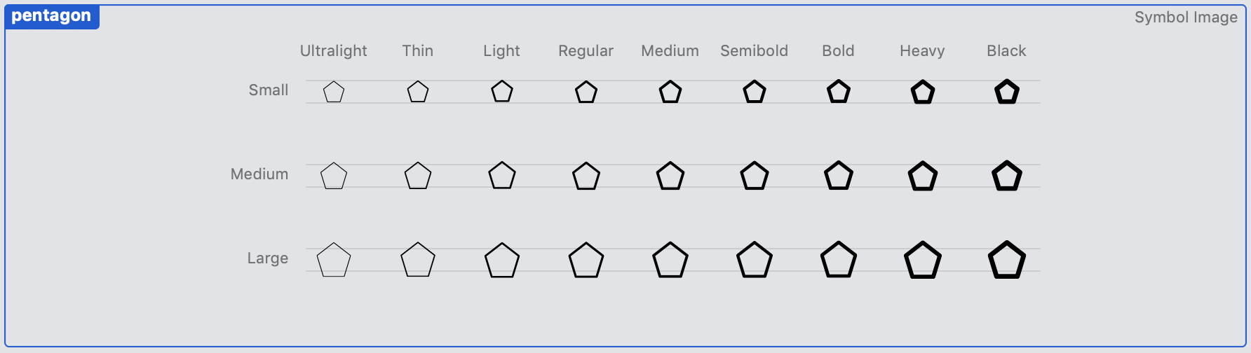
Step 8 - Continue for all Medium symbols
Continue this process of duplicating and moving until you have created symbols ranging from Ultralight-M to Black-M, making sure that you adjust the stroke widths of each shape to the appropriate size for each symbol, and rename your shape layers to use the SF Symbols naming conventions. Your medium shapes should then look like this:

Step 9 - Create Large and Small variants
Next we need to replace the large and small versions of the symbol with our pentagon shape. The simplest way to do this is to select all of the medium sized symbol layers that we have just created and create a duplicate of them by either right clicking on the layers and selecting 'Duplicate', or by using the ⌘J keyboard shortcut.
Once the medium size layers have been duplicated, move them down the canvas and vertically centre them alongside the Large variant symbols, dragging the layers whilst holding the shift key to maintain horizontal alignment with the medium size symbol layers.
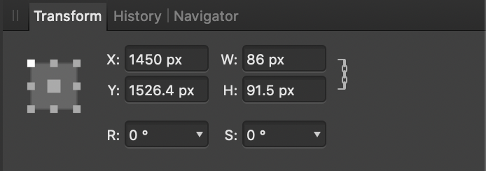
Having done this, you will need to select each of the shapes that you have moved to the Large symbol locations and enlarge them to match the large size. According to Apple's Guidelines, the large variant symbols should be 1.29 times larger than the medium symbols. In our case that means changing our pentagon heights from 91.5 to 118 points. To do this, select each of the large pentagon layers individually, and in the transform panel set the transform anchor to be centred horizontally and vertically, make sure the dimension lock is turned on, and change the height to 118.
Once you have resized all of the large shapes, delete the existing large symbols that came included in the SVG, and rename the enlarged layers to have an '-L' suffix.
Now you need to repeat this process to create the Small variant symbols. The process is exactly the same, except you will need to multiply the size of the Regular symbol by 0.79, which in our case with the pentagon means a height of 72 points.
At this point you may also wish to adjust the stroke widths of the shapes in the Small and Large variants if you feel like they need extra tweaking at those scales. Again, make sure that you have the correct layer names for your shapes, with the correct '-S', '-M', or '-L' suffix for the size variant.
Step 10 - Expand paths
If we were to export our symbol and use it in Xcode now, we would find that the tops and sides of the symbols would be cut off. The reason for this is that the dimensions of the symbols are defined by the paths that we have created, not by the stroke styling that we have applied.
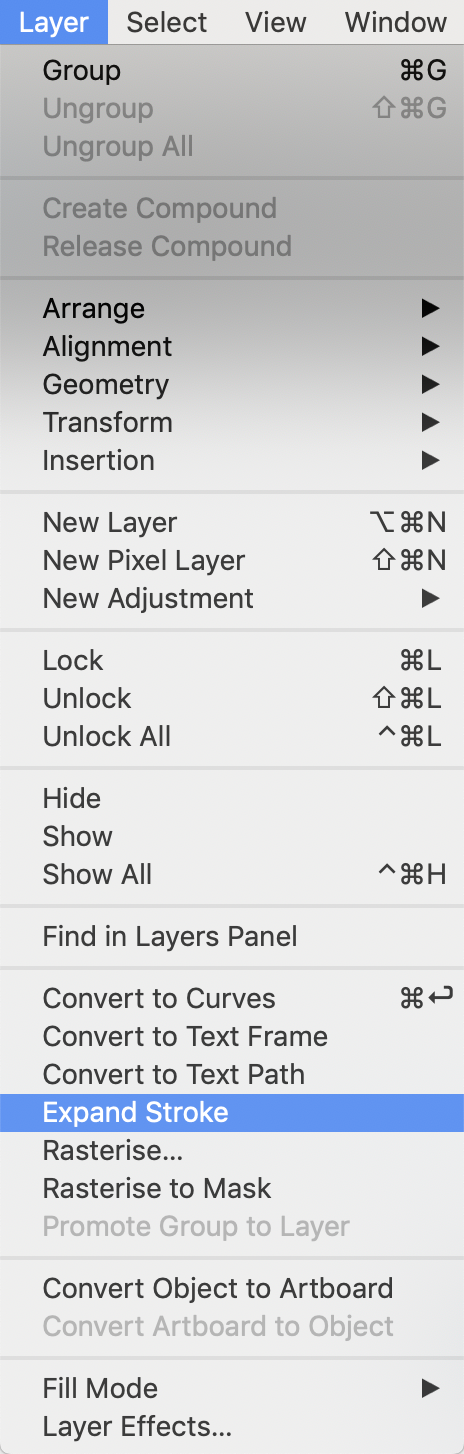
To fix this, we need to enlarge our shapes' paths to encompass the strokes applied to them. We do this by selecting a pentagon shape layer, and choosing Expand Stroke from the Layer menu:
Once this is done our layer contains two paths encompassing the whole of the pentagon:
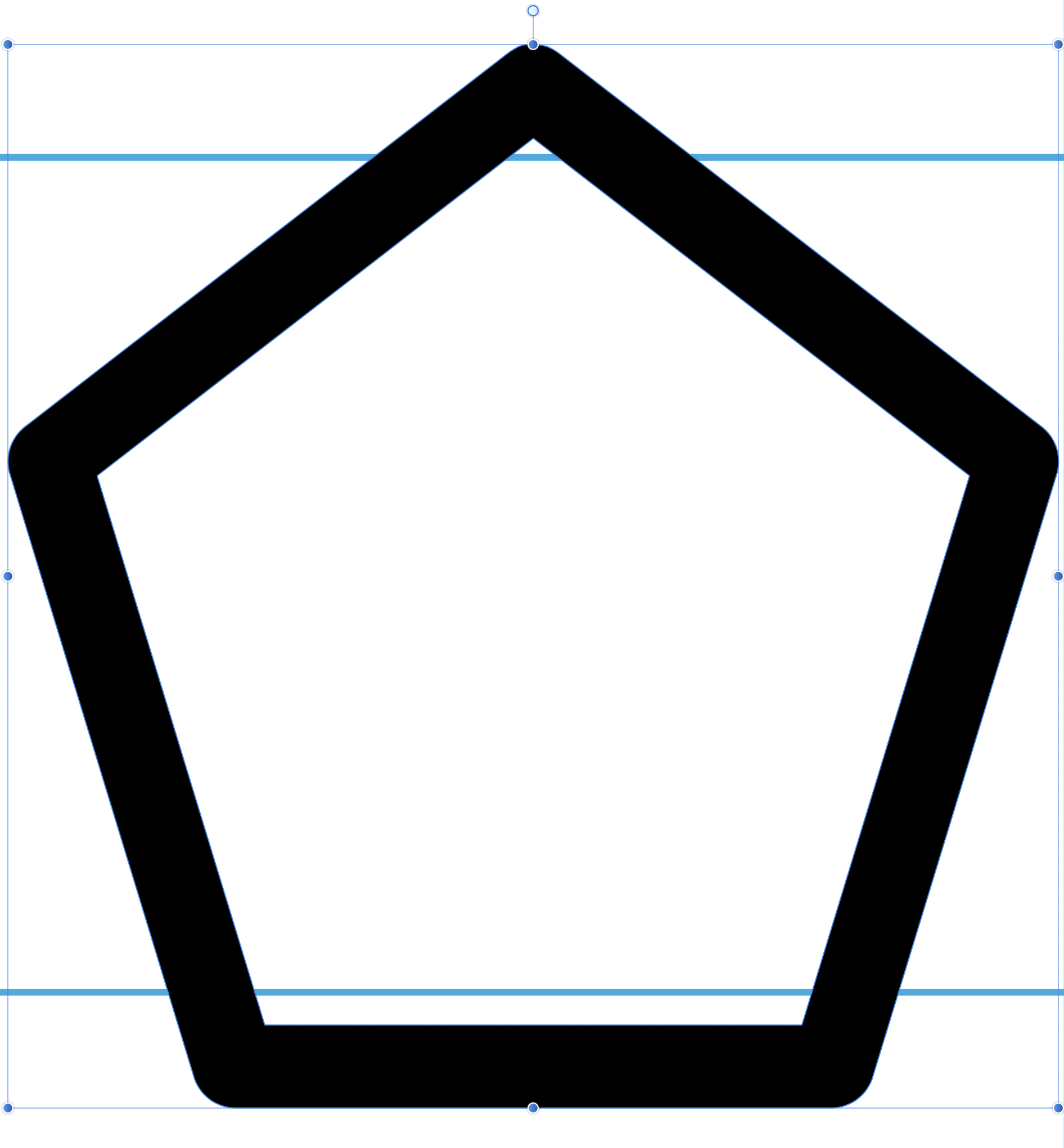
Unfortunately this step removes the layer's name, which means you will have to rename the layers with the appropriate Ultralight-S, Regular-M etc names.
Step 11 - Export SVG
Once you have expanded the strokes on all of the pentagons and made sure that the layer names are correct, we are ready to export our custom symbol for use in Xcode. Go to the File menu and click the Export... item. When the Export panel is presented, select SVG as the output format and leave the options as the default values.
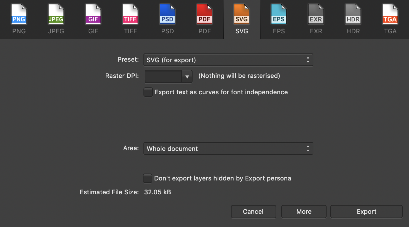
Click the Export button, and you're done. Our custom symbol is finished and ready for use in an app.
Using Custom Symbols in an App
Using our new symbol in an app is incredibly simple and requires only three steps:
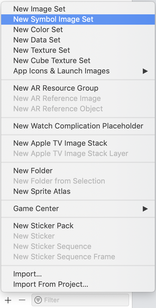
Step 1 - Create a new symbol asset
Open your application's asset catalogue and click the New Symbol Image Set item in the new asset menu:
Step 2 - Drag and drop the exported symbol SVG
Name the new symbol "pentagon", and drag the SVG we exported earlier in to it:
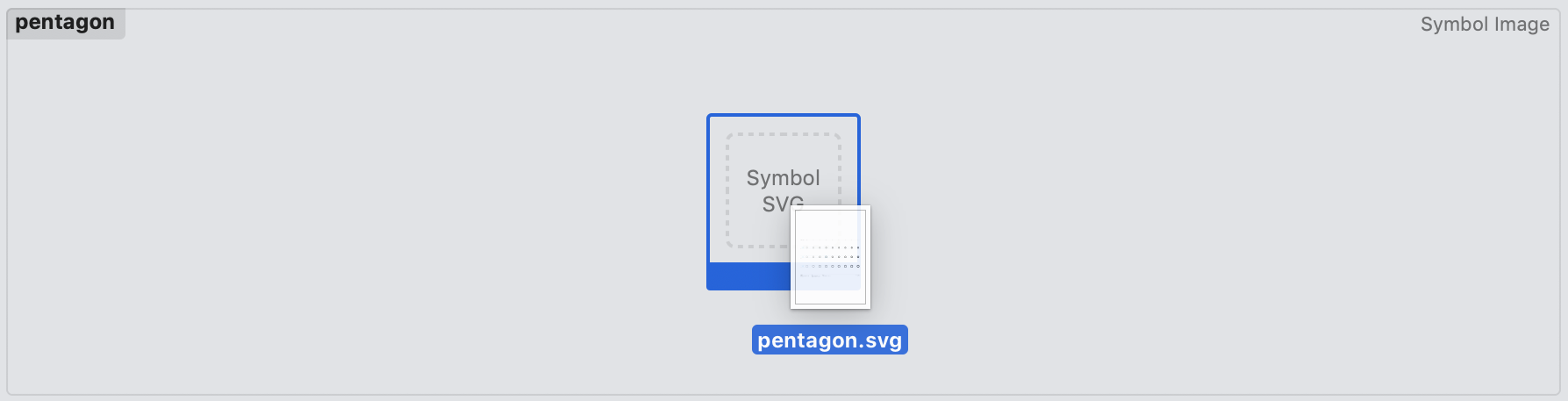
This will display a preview of the symbol that we have created:
Step 3 - Use the symbol
Using our new symbol programatically is incredibly simple. All we need to do is create a UIImage.SymbolConfiguration describing which of our symbol variants we would like, and create a new UIImage using the name of our symbol:
let symbolConfiguration = UIImage.SymbolConfiguration(font: .preferredFont(forTextStyle: .body), scale: .medium)
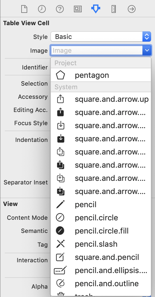
let symbol = UIImage(named: "pentagon")?.withConfiguration(symbolConfiguration)You will also be able to make use of the symbol from the image inspector in Interface Builder:
Sample Application
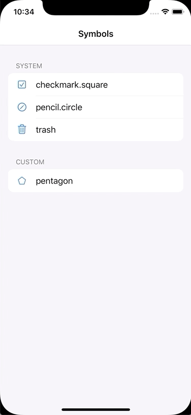
I have made a sample application available here to demonstrate the symbol that we have created alongside some of the system symbols so that you can see how it integrates fully with the SF Symbols ecosystem. The Affinity Designer source file for the symbol is also included.
Because we have created a symbol, and not just a simple graphics asset, we benefit from the accessibility behaviours provided by the SF Symbol system. For example, if a user enlarges the system font size on their device, our symbol is automatically scaled up appropriately:

Also, if a user turns on the Bold Text accessibility setting, the weight of our symbol is increased along with the text:
Conclusion
As we have seen, creating custom SF Symbols using Affinity Designer is a straightforward process that yields fantastic results in terms of platform consistency and accessibility. Whilst the Apple-provided set of symbols covers a broad range of scenarios, sometimes we require a custom icon to convey the precise meaning that we want, and custom SF Symbols are simply the best way to do this.