Introducing New Features to Users
Adding new features to an app is part of the standard app-update process. By giving users updates containing new functionality, we make our apps more useful and we stay competitive. However, one downside is that with each new feature we add we have to add more UI. More UI brings more complexity, which can make our apps harder to use. What's more, if our apps become difficult to use, users may give up on them entirely. Work we've done to make our apps more useful ends up driving users away - not what we wanted!
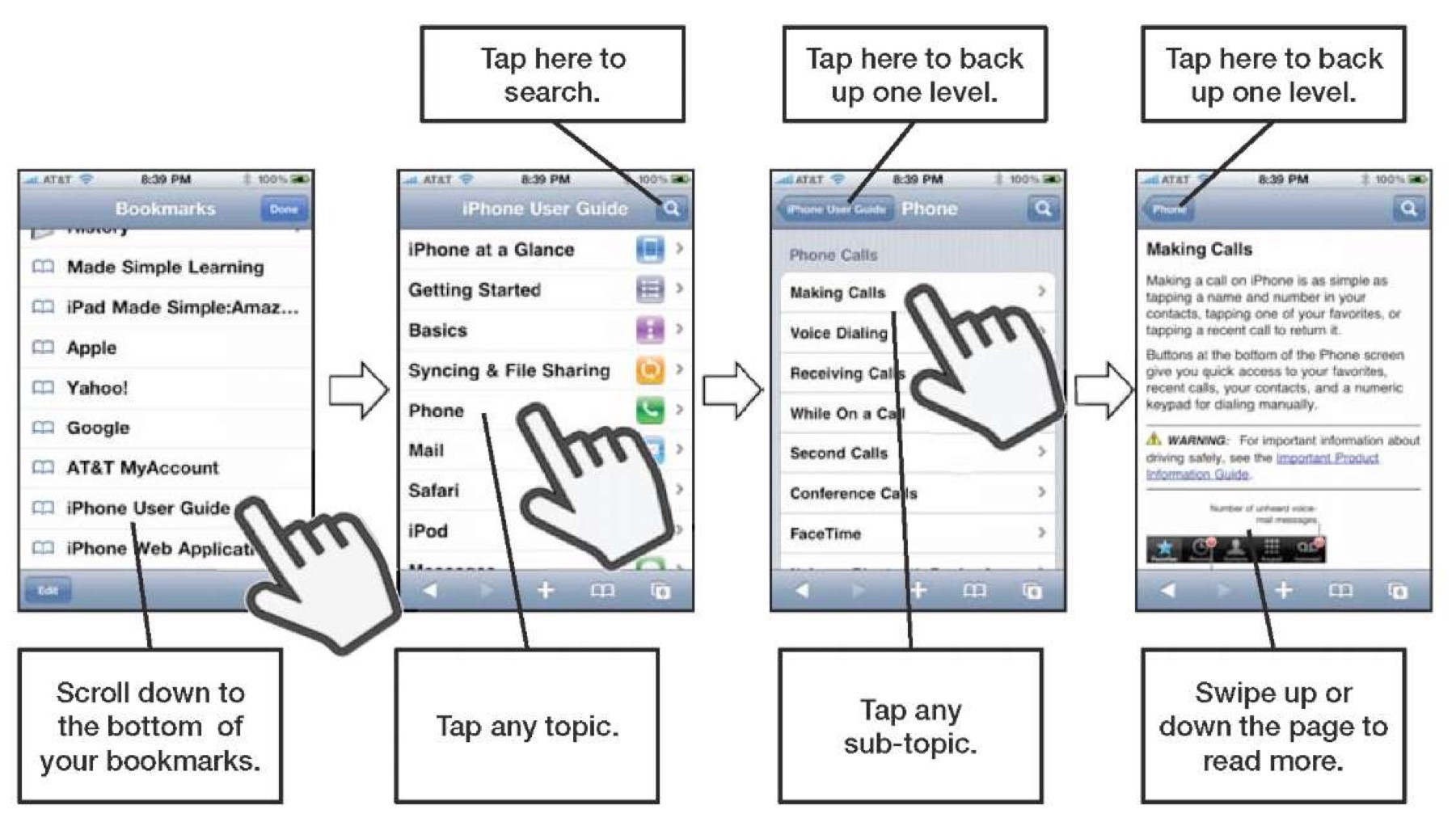
So, what is to be done? We can't stop adding awesome new features to our apps, so we have to find a way to add new functionality without confusing users. What's the best way to do this? Just add a user guide, right? We're going to add a user guide:

No. Who wants a user guide? You have to open them up and close them again - yuck. Nobody wants a user guide.
A far better option is to provide in-place help to your users. For example, a recent update to the Budgeted app added the ability to add financial transactions on Apple Watch using voice input. Other budgeting apps require users to peck at tiny buttons to create transactions on the watch, rather violating Apple's advice that watch app interactions should be no longer than ten seconds.
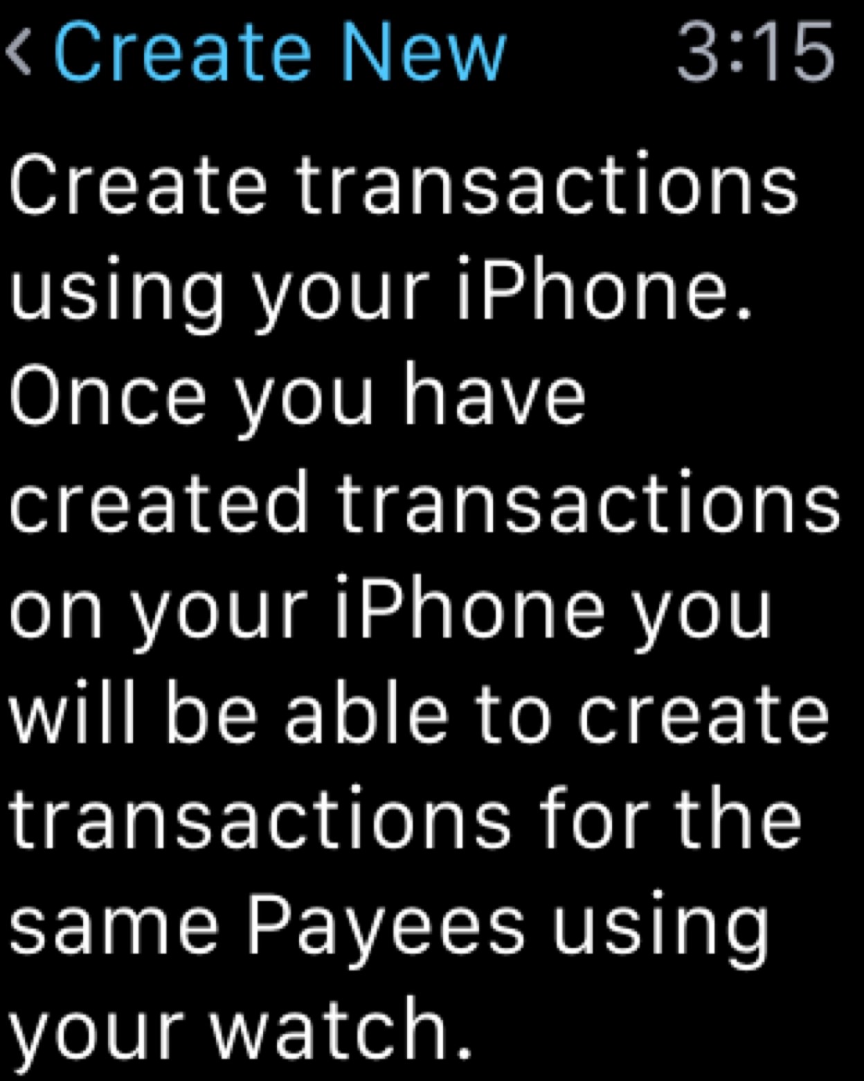
We need to introduce users to this feature, so when a new user first taps the Create Transaction button, they are shown the following:

No user guide required, just a simple explanation of how to use the feature in the place where the help needed. Users know that they have to begin by creating transactions on their phone, and that they will then be able to create transactions on their watch. Most importantly, they didn't have to consult a user guide or "Help" menu to find this out.
Taking It To The Next Level
Once the user has had the app for a while and has entered some transactions on their phone, we can do even better with the help we give them. Rather than just explaining how the feature works, we can show examples of text that can be spoken in to the watch in order to create a transaction. The key to getting this kind of help right is personalisation. We could easily display a sample of some speech like "I just spent £14.50 on Food in Waitrose" and be done with it. But what if the user doesn't buy food in Waitrose? They may not even have this retailer in their country, and they may not use the pound sterling. This help text could just end up being confusing.
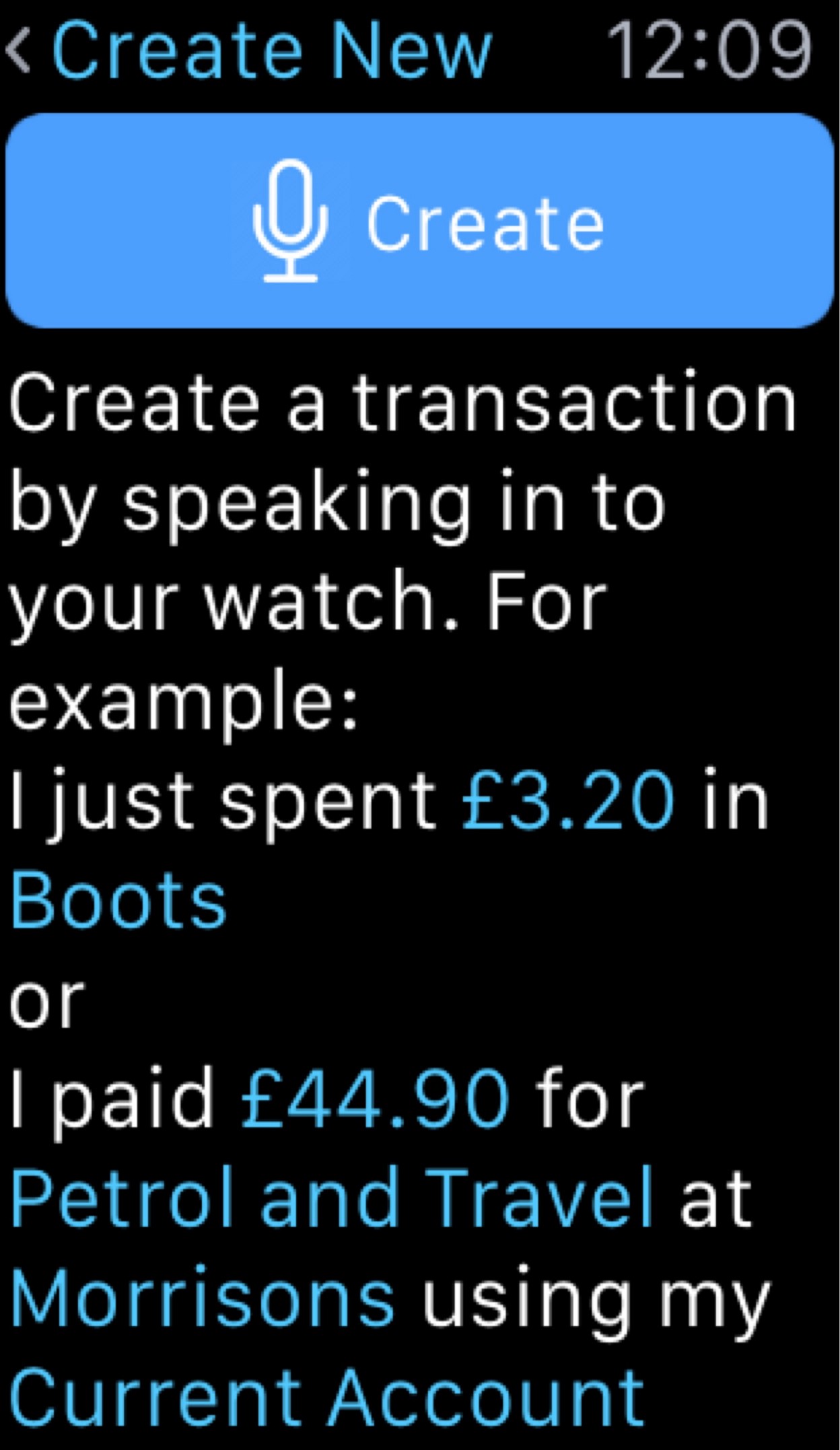
Instead, we need to personalise the examples. We can do this quite easily by looking at the user's data and providing customised help based on what we find. Using my own data, I see the following:

These examples are generated using the transaction data stored in the app, so they are relevant to the kind of transactions the user usually creates. Also, a user in a different locale will see their local currency as part of their personalised examples.
Notice that the transaction metadata is also highlighted to let the user know what kinds of information they can enter using speech. In the screenshot above, "Petrol" and "Travel" are Tags created by the user, so seeing these in an example lets the user know that they can tag their transactions when creating them using speech.
What's important here is that there's no complicated explanation, nothing explicitly stating what kinds of information can be entered; instead we have a couple of simple examples that convey this information, personalised to make sense to the user.
Summary
- Don't create a user guide
- If help text or examples are required, show them in the place where the user needs them
- Personalise the help where possible
When adding new features to your app, consider how the data you have access to can help you to create awesome help that will surprise and delight your users.