Respecting Accessibility in Custom View Controller Transitions
There are many accessibility options available today in iOS. Such technologies are not only to help those users with vision impairment, but also those with physical disabilities and hearing problems. To Apple's credit, many of these technologies can be utilised in 3rd party apps without any work required on the developer's behalf. However, for some accessibility options it is the developer's responsibility to take extra care when building their apps to ensure that all users can take advantage of what their applications have to offer. Today we will focus on one such accessibility setting in particular: "Reduce Motion".
What is "Reduce Motion"?
In iOS 7, Apple moved iOS's design language away from skeuomorphism towards a "flatter" design system. However, they preserved a sense of depth in the user interface with enhanced animations and parallax effects, helping to make the user interface feel "alive". For many users, these animations are part of what makes iOS such a delight to use, and for developers this animation system allows us to provide a customised set of transitions in our own applications where appropriate. Used correctly, these animations aid users' comprehension of the data flow and sense of place within an app.
Unfortunately, for some users these animations can have the opposite effect. Rather than helping them to use our apps, animations can induce motion sickness and even vertigo. Whilst Android users might be acclimatised to vomit-inducing user interfaces, iOS users have higher standards and we must respect them. To this end, Apple added the Reduce Motion accessibility option to the system Settings app. Enabling this option disables the Springboard parallax effect, and reduces the complexity of the system provided presentation animations. There are other subtle changes too - for example, with Reduce Motion enabled the Face ID animation displayed when the user authenticates is significantly simplified. All of this adds up to an experience with notably less motion, relieving those users who suffer from ill-effects when the standard system animations are applied.
Building a Custom View Controller Transition
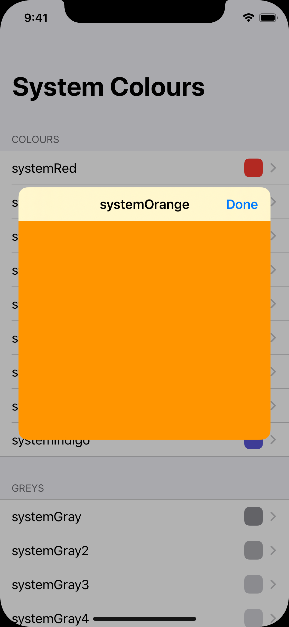
In order to show how to respect the Reduce Motion accessibility setting in our own apps, first we have to build an animated view controller transition. We will do this by building a simple colour palette app, which lists a set of colours and allows users to tap on them to see the selected colour in more detail. Helpfully, this example application has a gratuitous view controller transition built in:
Before we start, let's go over the terminology used in this part of the iOS ecosystem. A "view controller transition" is what occurs when we respond to some user interaction by showing a new view controller. These transitions are made up of two distinct parts - a "presentation", and an "animation." These are handled by "presentation controllers" and "animation controllers" respectively. Let's walk through the mechanics of building these components.
Building a Presentation Controller
Firstly, we need to customise the presentation of the view controller that is presented when the user taps on a colour. In this context, presentation refers to the position of the presented view controller's view, the size of the view controller's view, and any additional UI used to emphasise the presentation.
In this case of our colour palette example, the view presented when a user taps on a colour is positioned in the centre of the screen, is sized as a square, and has rounded corners. A dimming view is also faded in over the colour menu to emphasise the colour view that is being presented.
We create this presentation using a subclass of UIPresentationController, which we will call CentreSquarePresentationController. The first thing to do is specify the frame that the presented view controller should have. We do this by overriding the frameOfPresentedViewInContainerView property:
override var frameOfPresentedViewInContainerView: CGRect {
    guard let containerView = containerView else { return .zero }
    let containerBounds = containerView.bounds
    let minDimension = min(containerBounds.width, containerBounds.height)
    let padding: CGFloat = 48
    return containerView.bounds.insetBy(dx: (containerBounds.width - minDimension + padding) / 2,
                                        dy: (containerBounds.height - minDimension + padding) / 2)
}
Here, we use the smallest dimension of the presentation's container view to determine the size of our square. We add some additional padding, and use this to create a square frame positioned in the centre of the container view.
Next, we need to add provision for dimming the background during the presentation. We do this by adding a UIView property containing a semi-transparent view:
private lazy var backgroundDimmingView: UIView = {
    let dimmingView = UIView()
    dimmingView.backgroundColor = UIColor.black.withAlphaComponent(0.3)
    return dimmingView
}()
Now we need to handle showing and hiding this dimming view during the animated view controller presentation. We do this by overriding two methods:
override func presentationTransitionWillBegin() {
    if let containerView = containerView {
        backgroundDimmingView.frame = containerView.bounds
        containerView.addSubview(backgroundDimmingView)
        backgroundDimmingView.alpha = 0.0
    }

    presentedViewController.transitionCoordinator?.animate(alongsideTransition: { _ in
        self.backgroundDimmingView.alpha = 1.0
    }, completion: nil)
}

override func dismissalTransitionWillBegin() {
    presentedViewController.transitionCoordinator?.animate(alongsideTransition: { _ in
        self.backgroundDimmingView.alpha = 0.0
    }, completion: nil)
}
In presentationTransitionWillBegin, we set the size and location of the dimming view to cover the presentation's container view. We set its alpha to 0, and then add an animation closure to the presented view controller's transition coordinator to set the alpha to 1, fading our dimming view in alongside the transition animation.
We also override dismissalTransitionWillBegin to perform the inverse of the animation added in presentationTransitionWillBegin. This time we set the dimming view's alpha to 0, to fade it out.
Finally, we also need to round the corners of our presented view. We do this by adding the following lines to presentationTransitionWillBegin:
presentedViewController.view.layer.cornerRadius = 12
presentedViewController.view.layer.cornerCurve = .continuous
presentedViewController.view.clipsToBounds = true
Let's take a look at what we've got so far:
Great, we have all of the elements of our presentation completed: the position and size of the presented view, along with the dimmed background. But the animation isn't quite right yet. By default we just get the standard iOS behaviour of the presented view appearing from the bottom of the screen. Instead, we want the colour the user tapped on to be presented with a bouncy zooming animation, allowing the tapped colour to leap in to the centre of the screen. We do this by writing a custom animation controller.
Building an Animation Controller
An animation controller does exactly what its name suggests - controls an animation. We need to use one of these when presenting a view controller, and again when dismissing the view controller. We create one by making a new object that conforms to the UIViewControllerAnimatedTransitioning protocol. This protocol contains two required methods, which are:
func transitionDuration(using transitionContext: UIViewControllerContextTransitioning?) -> TimeInterval

func animateTransition(using transitionContext: UIViewControllerContextTransitioning)
The first of these controls the duration of the transition animation, and the second is where we carry out the mechanics of animating the views that are involved in the transition.
The precise details of the zooming transition animation are beyond the scope of this article, however the source code for the animation is available in the GitHub repository. The main point to take away is that the presentation of a view controller is decoupled from the animation that is used when it is presented and dismissed. This detail is important to remember for later on when we consider users with Reduce Motion enabled.
Now that we have discussed custom view controller presentation and animation, let's see how we tie the two concepts together to create a custom view controller transition.
Building a Transitioning Delegate
A transitioning delegate is the object responsible for coordinating the view controller presentation and transition animation for any given view controller when it is presented or dismissed. The system uses this object to determine how the presented view controller should be presented, and how the animated transition should be handled.
To create a transitioning delegate, we simply create a new object that conforms to UIViewControllerTransitioningDelegate. One of the methods in this protocol is used to vend the presentation controller to be used during a view controller presentation. We implement it like this:
func presentationController(forPresented presented: UIViewController, presenting: UIViewController?, source: UIViewController) -> UIPresentationController? {
    return CentreSquarePresentationController(presentedViewController: presented, presenting: presenting)
}
All we have to do here is create an instance of CentreSquarePresentationController, which is the UIPresentationController subclass we created earlier. The protocol method passes us the view controller being presented, along with the view controller that it will be presented from. These are then passed to the initialiser of the presentation controller.
Next, we need to provide the animation controller to use when a view controller is being presented. This is also very simple:
func animationController(forPresented presented: UIViewController, presenting: UIViewController, source: UIViewController) -> UIViewControllerAnimatedTransitioning? {
    return BouncyTransformTransitionAnimator(sourceRect: sourceRect)
}
Here we supply the transition animator that we described in the previous section. Its only parameter is the CGRect from which the animator should animate the presented view controller from.
Finally, we also need to provide an animation controller to use when the view controller is dismissed:
func animationController(forDismissed dismissed: UIViewController) -> UIViewControllerAnimatedTransitioning? {
    return BouncyTransformTransitionAnimator(sourceRect: sourceRect)
}
This is the exact same code again. This time the provided animation controller will use the sourceRect to animate the presented view controller back to where it was presented from in the presentation animation.
Now that we have our transitioning delegate configured, all that's left to do is assign it to the view controller being presented.
func colourPaletteViewController(_ colourPaletteViewController: ColourPaletteViewController, didSelectColourDetails colourDetails: ColourDetails, selectionRect: CGRect) {
    colourDetailsViewTransitioningDelegate = ColourDetailsViewTransitioningDelegate(sourceRect: selectionRect)
    let colourDetailsViewController = ColourDetailsViewController(colourDetails: colourDetails)
    colourDetailsViewController.delegate = self
    colourDetailsViewController.transitioningDelegate = colourDetailsViewTransitioningDelegate
    colourDetailsViewController.modalPresentationStyle = .custom
    present(colourDetailsViewController, animated: true)
}
The view controller acting as the presenting view controller has a colourDetailsViewTransitioningDelegate property. To this we assign a new instance of our ColourDetailsViewTransitioningDelegate, passing in the source rectangle supplied in the colour palette view controller delegate method that we are implementing here. Next we create the ColourDetailsViewController that will be used to display the colour that the user selected. Once we have created this view controller, we assign its transitioning delegate to be the ColourDetailsViewTransitioningDelegate that we just created. Finally, we set the modal presentation style to .custom, so that the presentation controller supplied by the transitioning delegate gets used for the transition's presentation. Finally, we present the colour details view controller using the standard iOS present function.
We have now completed our custom view controller transition. We have created a presentation controller responsible for centring the presented view, along with an animation controller to give us a bouncy zooming effect during presentation. But what about users with Reduce Motion enabled? This is the next piece of the puzzle. Fortunately, it will not take much additional work to build a great experience for these users too.
Respecting Reduce Motion
We can check to see if our user has Reduce Motion enabled by checking the UIAccessibility.isReduceMotionEnabled API. One approach we could take to adapt our view controller transition for Reduce Motion would be to check this flag in our animation controller and provide a different animation if Reduced Motion is enabled. However, this would not be the correct approach for two reasons. Firstly, we would be breaking the single responsibility principle - our animation controller should provide one type of animation only. Secondly, if we took this approach then we would have to duplicate the handling of the Reduce Motion option in all of our animation controllers, violating the DRY principle.
Instead, we will write a completely new animation controller for use when our user has Reduce Motion enabled. This animation controller will provide a simple cross fade effect, which is a much gentler animation than the one we created earlier. The code for this is very simple:
final class CrossFadeTransitionAnimator: NSObject, UIViewControllerAnimatedTransitioning {
    func transitionDuration(using transitionContext: UIViewControllerContextTransitioning?) -> TimeInterval {
        return 0.5
    }

    func animateTransition(using transitionContext: UIViewControllerContextTransitioning) {
        let toViewController = transitionContext.viewController(forKey: .to)!
        let isPresenting = toViewController.isBeingPresented

        if isPresenting {
            transitionContext.containerView.addSubview(toViewController.view)
            toViewController.view.alpha = 0
            toViewController.view.frame = transitionContext.finalFrame(for: toViewController)
        }

        UIView.animate(withDuration: transitionDuration(using: transitionContext), animations: {
            if isPresenting {
                toViewController.view.alpha = 1
            } else {
                transitionContext.viewController(forKey: .from)!.view.alpha = 0
            }
        }, completion: { _ in
            transitionContext.completeTransition(!transitionContext.transitionWasCancelled)
        })
    }
}
This is all of the code required for a cross fade animation controller. It simply fades the presented view in to place when presenting, and fades it out when dismissing.
Now that we have our cross fade animation controller written, all we need to do is return it from our transitioning delegate when the user has Reduce Motion enabled. We do this by modifying the two animation controller functions that we wrote earlier:
func animationController(forPresented presented: UIViewController, presenting: UIViewController, source: UIViewController) -> UIViewControllerAnimatedTransitioning? {
    guard UIAccessibility.isReduceMotionEnabled == false else {
        return CrossFadeTransitionAnimator()
    }
    return BouncyTransformTransitionAnimator(sourceRect: sourceRect)
}

func animationController(forDismissed dismissed: UIViewController) -> UIViewControllerAnimatedTransitioning? {
    guard UIAccessibility.isReduceMotionEnabled == false else {
        return CrossFadeTransitionAnimator()
    }
    return BouncyTransformTransitionAnimator(sourceRect: sourceRect)
}
When Reduce Motion is enabled we return our cross fade animation controller, giving the user a calmer transition:
Note that despite the change in animation, the position of the presented view and dimming background remain the same as they are handled by the presentation controller. For any other custom transitions in our app, we can take the same approach in the respective transitioning delegates to use our cross fade animation for users with Reduce Motion enabled.
Conclusion
As we have seen today, supporting users who require the Reduce Motion option to be enabled in order to use their phones is not a difficult task at all. By considering which parts of your app could cause a problem for these users, and providing an alternative, we can help to ensure that our apps are accessible for everyone. To find out more, consider reading Apple's documentation on the feature and checkout the Reduce Motion sample project on GitHub.