App Design on a Budget Part 1: Tools
For indie app developers, user interface design can often be the hardest part of developing an app. There is no formal logic, or provably correct way to go about designing a UI, so creating compelling user interfaces that are beautiful (and hopefully delightful) as well as functional can be a tough hurdle to clear. Worst of all, our instinct to get stuck in and start coding is easily the most inefficient way to go about testing different ideas of how a user interface should look and feel.
Over the last couple of years, I have tried to come up with a new workflow for this task that reduces the amount of time that it takes, but is also more likely to result in the best possible design (by possible I mean designs that you can think of - I make no promises about this process massively improving their quality!). Let's take a look at these steps in a little more detail.
Step 1. Iterate Iterate Iterate
All that time wasted writing coded prototypes can be saved very easily by choosing lower fidelity tools to quickly iterate your ideas. I've found the best tool for this is the superb Paper app by FiftyThree. In particular, Paper features some awesome tools for rapid white-boarding which lend themselves very nicely to sketching out app interfaces. Shapes can easily be drawn and duplicated very quickly, making it easy to mock up buttons, tables, and collection views.
This mock-up process will allow you to see the pros and cons of your designs immediately, allowing you to refine your ideas to be the best they can be. They also allow you to discount bad ideas and come up with something new when your first design isn't up to scratch. By the time you complete this rapid prototyping step, you should have a solid design that is ready to be developed more thoroughly.
Step 2. Refine
This is the stage where you produce something along the lines of what a designer would give you if you had a designer. Before getting in to Xcode you need a high fidelity design that looks exactly how you want you app to look once it's built. This is where you set the exact sizes of your interface elements and refine their precise layout.
For this step I use Affinity Designer by Affinity, which is very much like Photoshop without the annoying subscription model, and has some great features for developing your UIs. One of these features that I really love is forcing pixel alignment, meaning that your vector shapes will be aligned to the pixel grid, so when you export any image assets that you need they won't be awful and blurry.
One other awesome feature in Affinity Designer is the split view mode, which allows you to view your document in vector and pixel modes at the same time:
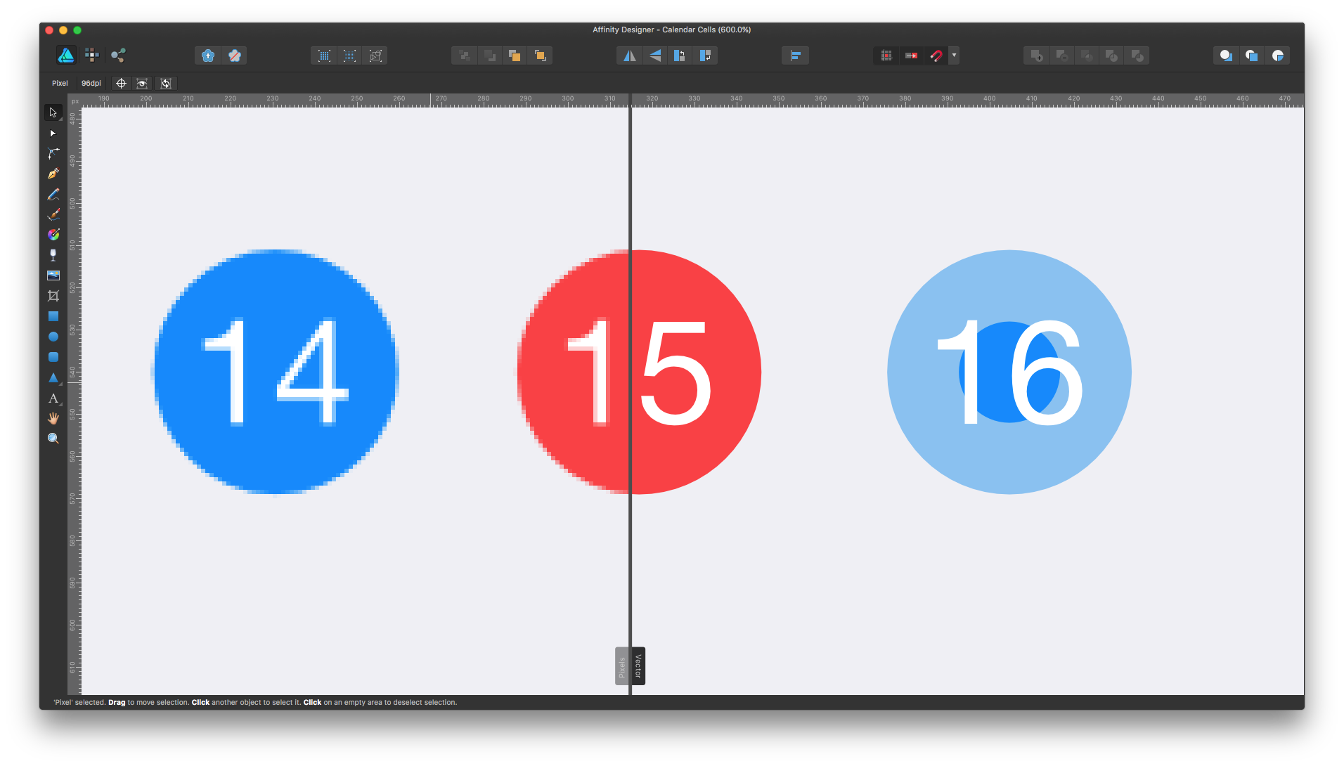
This is a really nice way of allowing you to design using vectors, but also see what your designs will produce when rasterised.
Step 3. Implement
The fun bit - building the UI in Xcode. Although we may have put off coding for as long as possible, what you will now build having gone through steps 1 and 2 will be the right design, so you only need to do it once.
Example
I used this workflow to create the Budget Calendar view in the Budgeted app. I wanted a way for users to be able to browse their budget history quickly and have the information about whether they stuck to their budget or not be easily visible. I decided a calendar was the best way to go about this, with the existing positive and negative colours (blue and red) being used to show the budget status for each day in the calendar.
Next I decided to draw the calendar with slightly more detail, deciding on the rough style of where headers would be positioned and the number for each day.
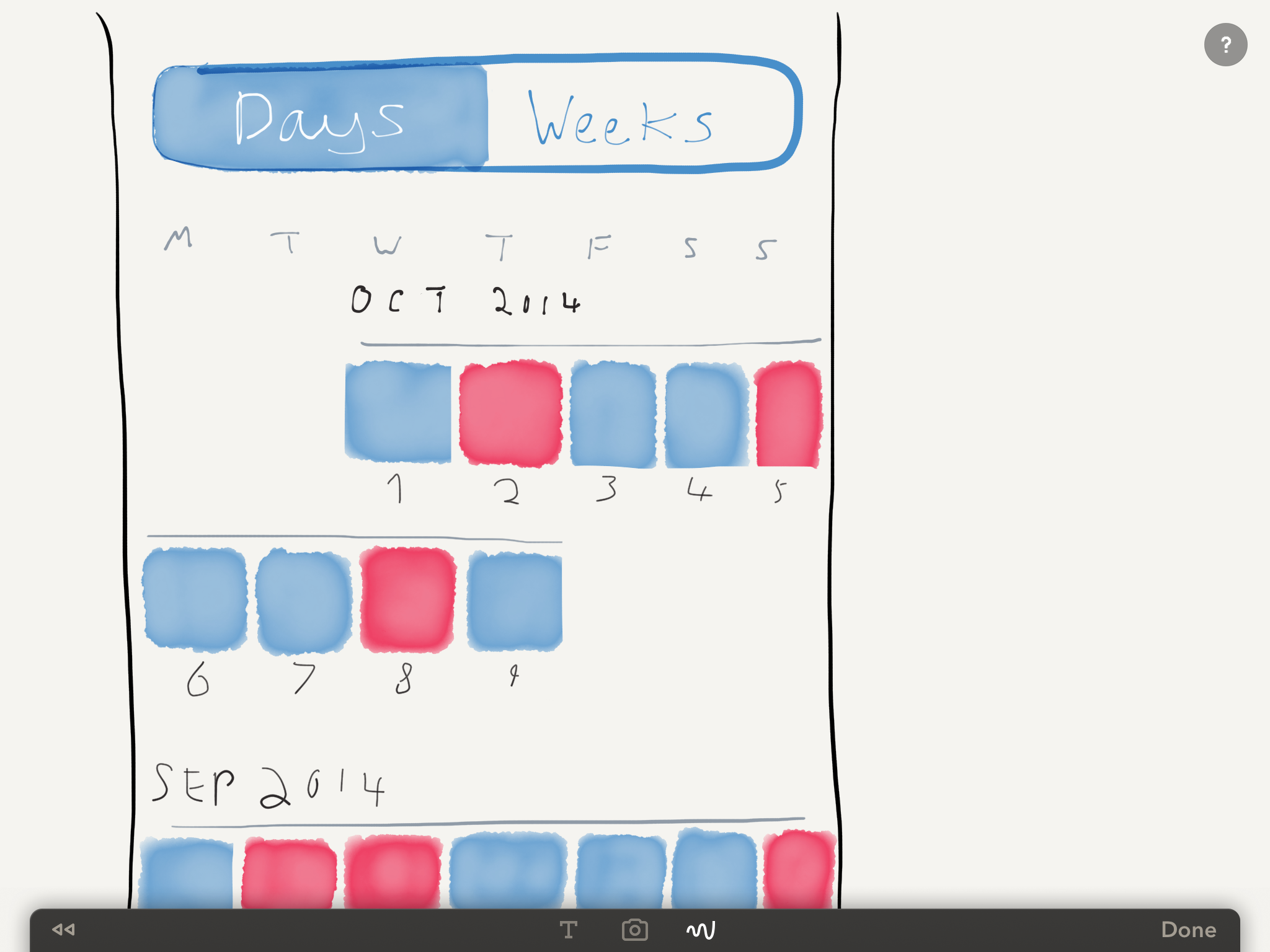
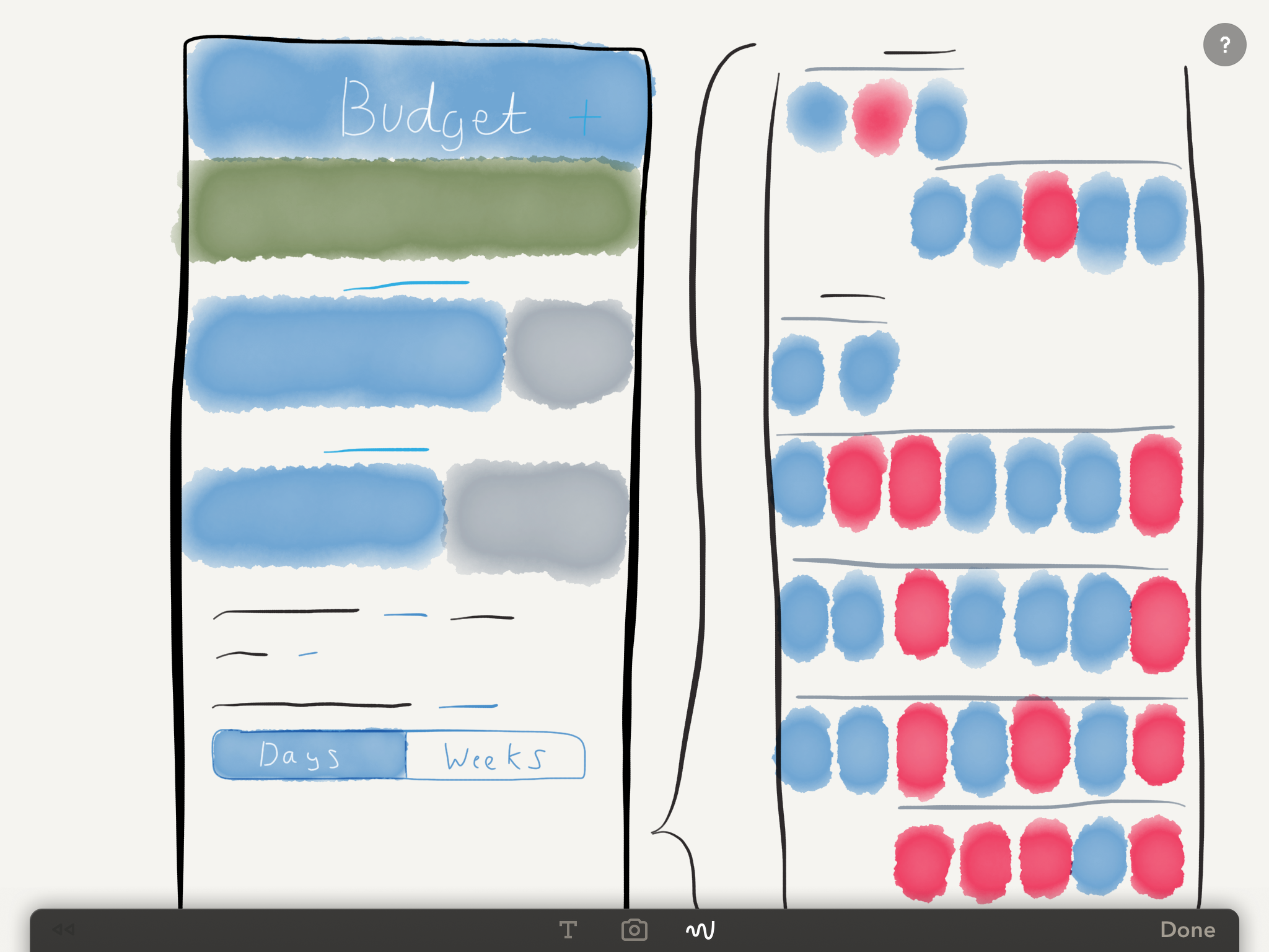
Then I drew some of the day cells in more detail. This initial design has a progress bar in each cell, mirroring the progress bars that are already used in the main budget interface for the current day and week (these progress bars fill up with the blue colour as money is spent, and turn red if the user goes over budget).
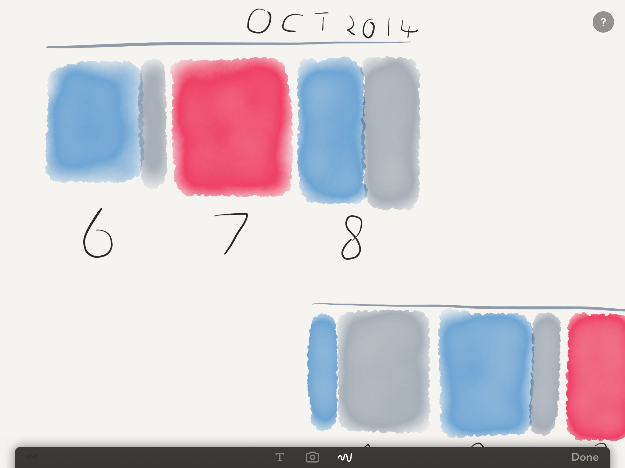
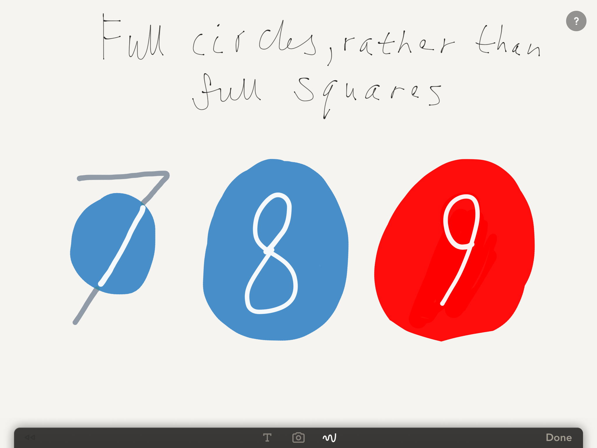
At this stage I realised that the cells would be larger than I would like – having a progress bar with the day number beneath it made them too tall. To solve this, I could have put the number over the progress bar. However, this would have looked cluttered when there are lots of cells with slightly different progress bar lengths all in a row. Instead, I wanted to try making the cells "fill up" with colour to make it easy to glance at the calendar and see days that were almost over budget as more filled up that others.
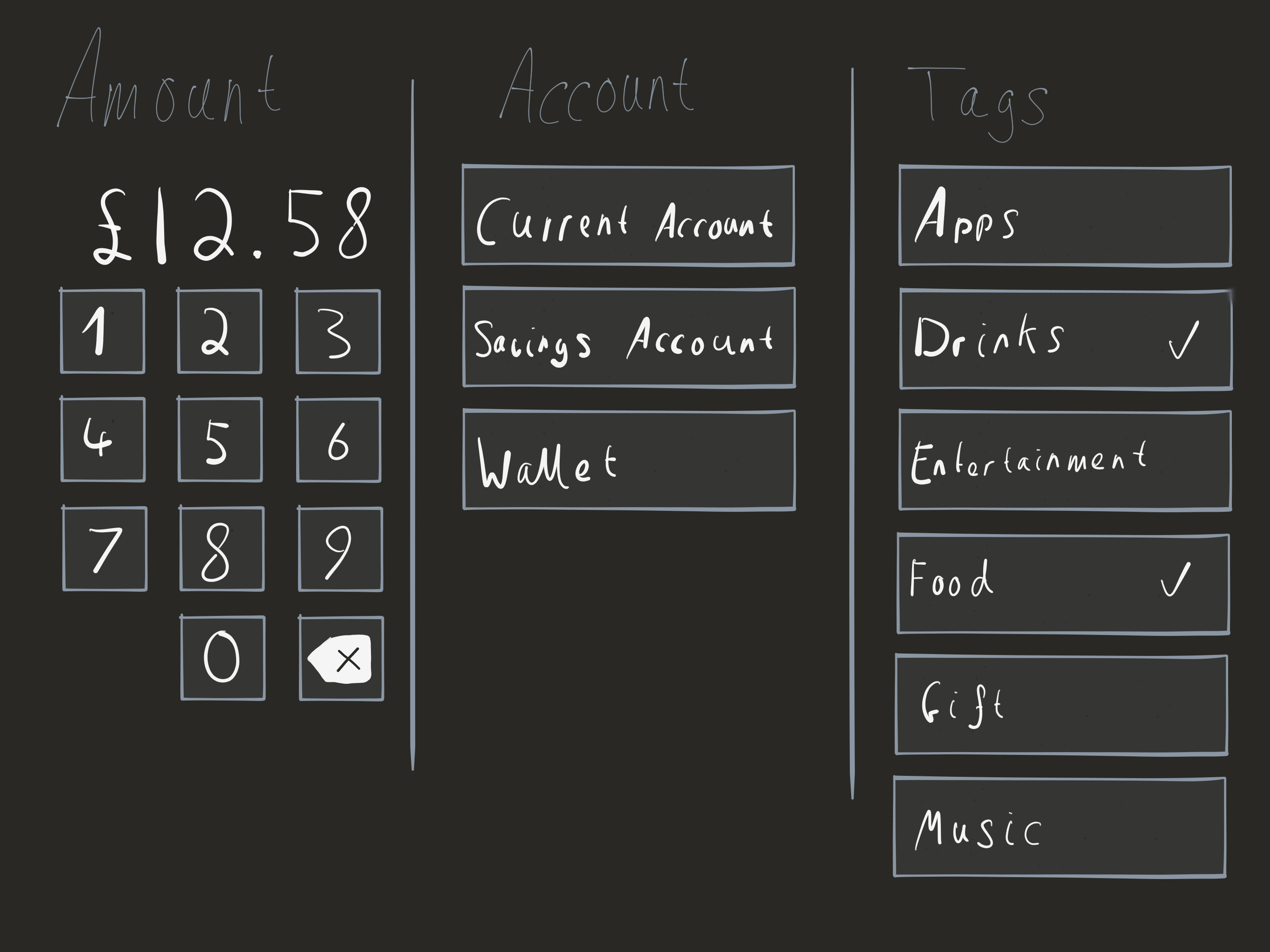
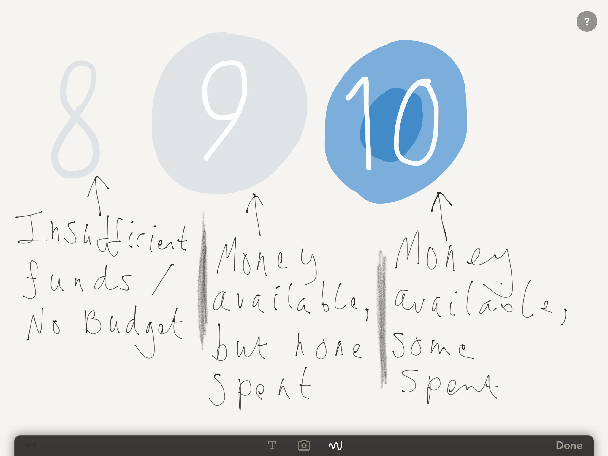
I also needed to think up cell styles for days when the user had spent no money, or wasn't budgeting.
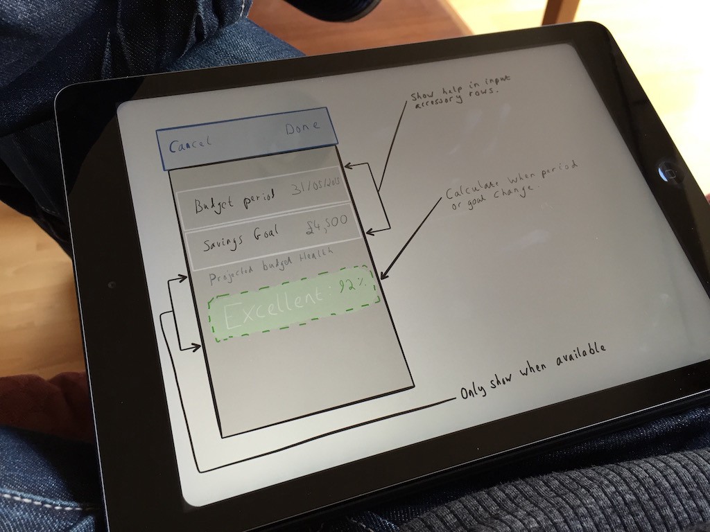
Having mocked up these rough designs, it was time for step 2 – a high fidelity mock-up.
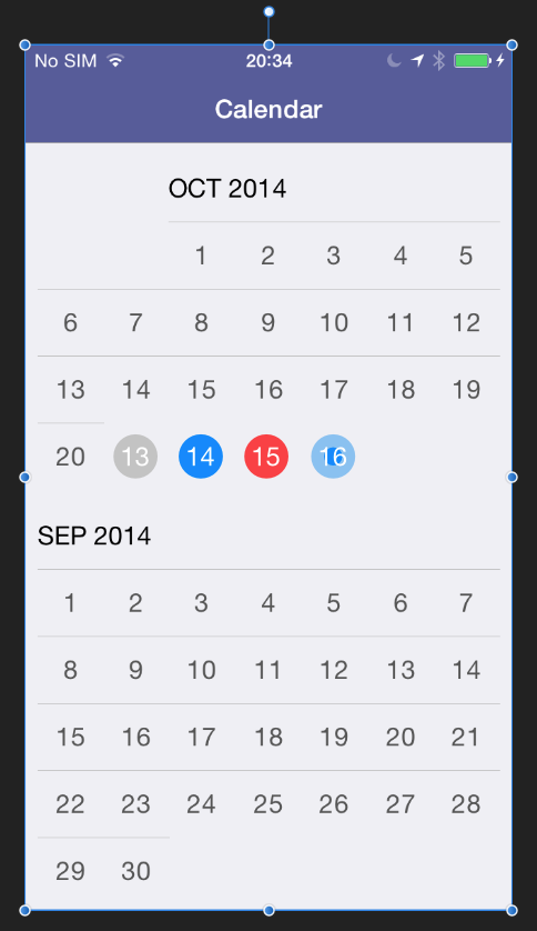
This final mock-up made developing the interface in Xcode far easier. Having a pixel precise design made writing the collection view layout simple as I knew before hand the size and location of each cell, and didn't need to tinker endlessly while coding. The only change I did make after this design was to remove the row dividers, as they made the calendar look a little crowded. The final result, with real world data, looks like this:
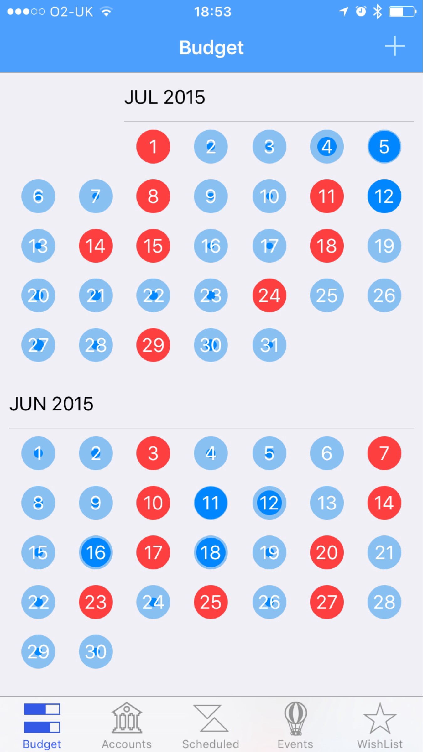
This final design fulfils the original brief very nicely. A user can easily see a large amount of their budget history, seeing which days were over budget as well as how close they came to being over budget on other days.
Conclusion
Hopefully through the above example I've demonstrated the value of this simple design workflow. The barrier to entry is very low; you just need a few apps and a bit of imagination. The next time you add a feature to your app, see how drawing out designs and fast iteration can help you to create a great user interface for you users.
In part 2 of this blog, I will demonstrate how to take your flat user interfaces and add the polish to make them truly special. Tune in next week!