App Design on a Budget Part 2: Animation
A great user interface doesn't just look great - it has to feel great too. In Part 1 we looked at ways to develop the look of a user interface, but this only considered the static design. Today we will focus on how to refine our UIs to provide a great dynamic user experience.
What do we mean by a user interface that feels great? Feel is the way an app behaves when the user interacts with its UI. Specifically, the way an app animates its on screen elements and transitions between states can make all the difference between a dull, flat feeling app, and a delightful product that users love to come back to.
Great Artists Steal
Again here indie developers face a similar problem to the one we discussed in Part 1, which is that thinking of and designing these nice animations and transitions can be very difficult. Fortunately, iOS is full of inspiration. The system apps as well as many third party apps demonstrate a carefully considered and polished feel, and there's no reason that you can't borrow these ideas or use them as the basis to create something new. Of course animation should never be added simply for the sake of it - if an interaction does not require animation then don't add any. Gratuitous animation quickly becomes annoying to users, which is the opposite reaction from the one we want them to have which is one of delight. Instead, focus your attention to areas of your interface where you can help the user make better sense of your app through animation.
Examples
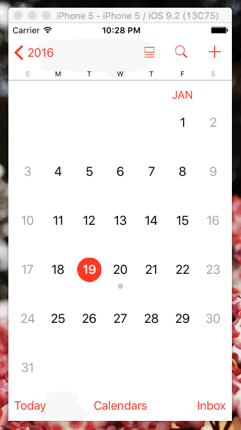
First we will look at an example of using animation to add an extra bit of polish to an interface. Take the Calendar app that comes pre-installed on the iPhone. Go to the month view and give it a good hard scroll. When the scrolling finishes, do you notice anything? No? Give it another good scroll and wait for the scrolling to finish. Have you spotted it yet?
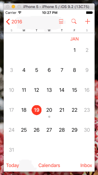
When the calendar finishes scrolling, it always finishes scrolling with a month perfectly aligned at the top of the view. Notice that it doesn't do this if the user scrolls gently, as the behaviour would be irritating if the user is scrolling with precision.
Why have Apple done this? When a month is perfectly aligned to the top of the view, it maximises the amount of useful information on the screen. A partially visible month isn't very useful, but with this animation behaviour a user will always be able to see at least a full month on their screen. This is the kind of subtle polish that we should all aspire to in our own apps.
Next we will consider an example of a customised transition and how this can vastly improve user experience. Sticking with Calendar.app in the month view, tap on one of the day cells. You will see the following:
If you look carefully you will see that this is a navigation controller pushing and popping views off of its stack. This is fairly run of the mill for an iOS app, but what isn't run of the mill is the transition. Rather than using the standard push and pop animations that come for free with the navigation controller, the day that the user selected appears to open out right from where they tapped.
Again, this is not just animation for the sake of it. This transition helps maintain the user's sense of place within the user interface as the day they select appears to open out from within the calendar, right where they tapped. Consider the user experience of using the standard push and pop animations here. The UI would still work, but would not assist the user at all in remembering their place within the calendar. The user would need to remember this themselves, which is an extra mental load that we have seen can be alleviated through careful use of a transition animation.
Example Project
I have created a sample project (downloadable here) demonstrating techniques similar to those found in the Calendar app, so you can see how to implement these kinds of ideas in your own projects. The main interface is a table view, the scrolling of which leaves a cell aligned with the top of the UI. Selecting a cell also transitions to a details view which animates to and from the selected cell.
Conclusion
iOS has incredibly powerful APIs for creating beautiful animations and transitions. When building new features in your apps, consider whether using these techniques could help to make your app easier to understand and delightful to use. Don't be afraid to steal great ideas.